Everyone knows the ESPN logo: Bright red color, slightly angled uppercase letters, and a horizontal line cutting through the middle.
But the legacy sports media company has never actually had official brand identity guidelines down on paper—until now.
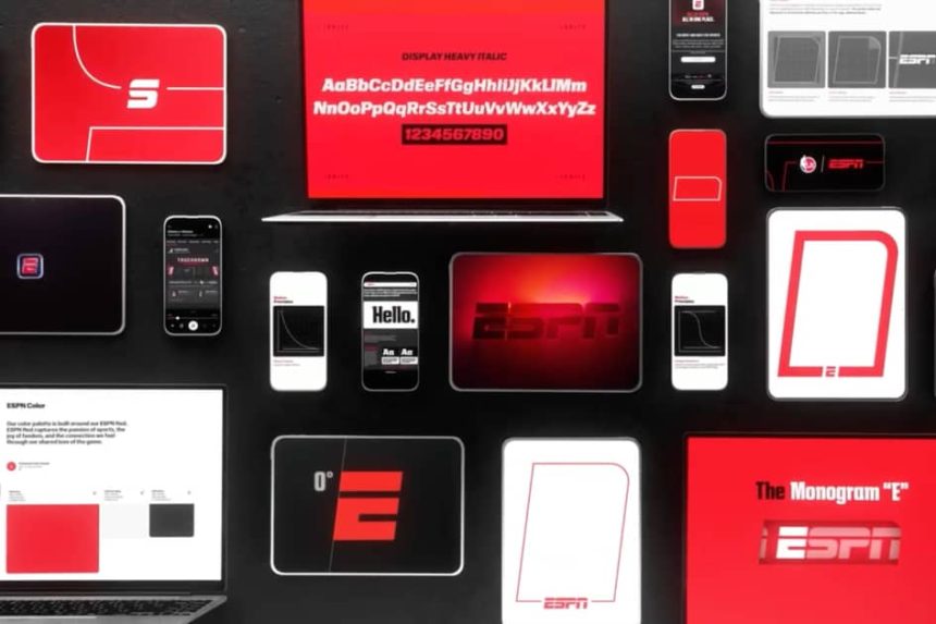
After several months of work, the ESPN Creative Studio team officially introduced its identity framework, which includes a custom typeface, the exact degree angle of the “E,” and an officially authorized shade of red, ahead of the six-month anniversary of ESPN’s newest direct-to-consumer service last month.
Chin Wang, VP of design, creative systems, and strategy at ESPN Creative Studio, said the DTC platform roll-out was the moment that execs realized the brand could benefit from more officially cemented design principles.
“We realized the ESPN brand did not have a clear definition,” Wang told Marketing Brew. “When you thought about ESPN, you thought about the logo, and then you thought about the color red, and there was nothing else to really hang our hat on to create any sort of cohesive, identifiable design system.”
As ESPN gears up for its first Super Bowl broadcast next year, the guidelines for its brand identity are meant to be used internally across the many divisions of the Walt Disney Company, on its social and digital platforms, at live events, and by its brand and content partners, to help define the brand even better and in more ways.
Seeing red
To be clear, “the identity doesn’t change,” including the logo, Carrie Brzezinski-Hsu, SVP of ESPN Creative Studio said. The team was especially careful given consumer reactions to rebrands gone wrong in recent years, Wang added.
Instead, they defined existing characteristics of the brand more clearly to help allow for broader use cases. The angle of the logo, for instance, is exactly seven degrees, and making that widely known may allow the logo to be accurately adapted and used across more assets, Wang said.
“ESPN on your phone as a tiny icon has to work also when we’re building out a huge billboard in LA,” she said. “How do you have a brand identity that can scale from six inches to 60 feet?”
The logo isn’t the only asset involved in brand materials. The creative studio established a custom typeface with its own name, “Ignite,” which serves as a “very subtle way” to foster cohesion, Wang said. All the letters in the Ignite font are, like the logo itself, angled at seven degrees.
Get marketing news you’ll actually want to read
Marketing Brew informs marketing pros of the latest on brand strategy, social media, and ad tech via our weekday newsletter, virtual events, marketing conferences, and digital guides.
The name was determined by a design team vote, Wang said, and “Rasmussen,” referencing ESPN Founder Bill Rasmussen, was the runner-up. That name, though, “didn’t really roll off the tongue,” she said.
ESPN’s brand color might seem more straightforward than its font, but there were actually around two dozen different shades of red being used across the company, Wang said. To agree on just one, the creative team tested different shades to make sure they were web accessible and would pop in digital ecosystems, she said.
The name of that color is simple: ESPN red.
Need for speed
ESPN has been around for almost 50 years, so why roll out the brand framework now?
While the start of the DTC push served as one motivating factor, the increasing fragmentation of sports media rights and bundling of streaming services was another, Brzezinski-Hsu said. ESPN shows up visually on TV homescreens and as tiles in Disney-owned streamers like Hulu and Disney+, and viewers arrive at the channel in a variety of ways. Brzezinski-Hsu said she wanted those viewers to know that whatever game they’re watching, they’re watching it on ESPN.
“We were really proud of the amount and the level of championship games we have at ESPN, and we wanted to be clear that…that game or match-up is with us,” she said.
ESPN has also created co-branded campaigns with some of its sponsors, so there was a practical need to get all parties involved in those collaborations on the same page, Brzezinski-Hsu said. In this case, there’s now a landing page laying out brand guidelines. It “ends up being a big time saver in terms of approvals,” she said.
And what better time to roll this out ahead of the upcoming Super Bowl broadcast, when ESPN branding will be sure to reach massive audiences? Even assets like insert graphics can be “a subtle yet impactful way to extend the brand,” Brzezinski-Hsu said, making the timing practical. Before next year, brand assets leveraging the new guidelines will show up in places like mobile apps, marketing graphics, and at live events.
There are other pluses to having a set of official brand guidelines, too. “It’s almost a badge of honor for employees, too, [who] work so hard here and want to make sure that the brand stands out in places they are,” Brzezinski-Hsu said.
Read the full article here